Color Harmony Secrets

Naveen Kumar
| 21-08-2025
When we walk into a room, the first thing we often notice is the color. It sets the tone, builds the atmosphere, and instantly affects how we feel. In soft decoration—like cushions, curtains, rugs, and throws—color isn't just for beauty.
It helps unify the whole space. So how do we match colors in a way that feels natural, warm, and balanced?
Start with a base color
A simple and practical way to start is by picking a base color—usually a neutral tone like beige, grey, white, or a soft earthy hue. This will be the foundation of the room, covering larger surfaces like walls, sofas, or curtains.
Why is this step important? Because a calm base allows us to add accent colors later without making the space feel chaotic. Think of it like a canvas—we need something quiet before we add the pops of personality.
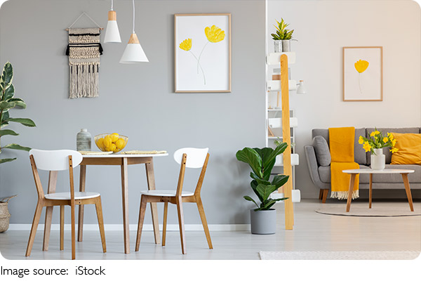
Use the 60-30-10 rule
Here's one of the easiest and most useful tricks in home design:
• 60% Main color – This is your base color.
• 30% Secondary color – A color that complements or contrasts gently.
• 10% Accent color – A bold or standout color that draws attention.
For example, we might have white walls (60%), dusty blue cushions and rugs (30%), and a few mustard-yellow throws or artwork (10%).
This formula works like magic. It gives visual balance and helps us decide where to focus our design energy.
Understand warm vs. cool tones
Colors fall into two main families: warm and cool.
• Warm tones: red, orange, yellow – They create energy, coziness, and vibrancy.
• Cool tones: blue, green, violet – They feel calming, clean, and refreshing.
We can mix both, but the key is to let one dominate. For example, in a room with mostly cool colors like pale grey and navy blue, we can add a few warm accents like brass or ochre to keep it from feeling too cold.
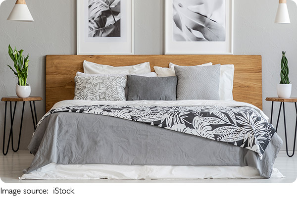
Don't underestimate neutrals
We often think "neutral" means boring, but that's not true! Soft neutrals like taupe, ivory, or greige (a grey-beige mix) help balance stronger colors and create a timeless look. We can also layer multiple shades of the same neutral to add depth—think beige curtains, a lighter beige sofa, and sandy-toned cushions.
Add texture for interest
Even when using just a few colors, mixing textures—like linen, velvet, cotton, and wool—keeps things visually rich. A cream throw pillow in chunky knit feels completely different from a cream silk one, even though the color is the same.
So when working with soft decoration, don't just think "what color?"—also think "what material?"
Use color to guide the eye
Strategically placed color can lead the eye across the room. A soft green plant near a green cushion on the couch? Instant visual flow. A pop of red in the artwork echoed in a nearby rug detail? It creates connection.
We don't have to overthink this—just look for little ways to repeat colors throughout the space. Repetition builds harmony.
Test it before you commit
Before buying anything, we can always test our ideas with mood boards or small samples. Lay out fabric swatches, paint chips, and photos of the furniture. See how they feel together under natural and evening light. It's a small step that saves a lot of regret later!
Let's make color fun
At the end of the day, color is one of the most personal parts of design. It reflects our mood, our memories, and our personality. Some of us might love calm neutral palettes, while others prefer bold and colorful combinations. There's no single "correct" answer.
So Lykkers, what colors speak to you right now? Maybe it's time to refresh that living room or bedroom with a few new cushions—or even just a change in curtain color. You'll be amazed what a difference color can make!